Result analysis and plotting with enb
The enb.aanalysis module provides several classes to help you analyze and
visualize your results. These classes accept pandas.DataFrame instances, which can
be produced by your enb-based scripts or imported via pandas.read_csv().
These classes produce:
Plots in PDF and PNG format
Summary tables in CSV and .tex format
The analysis and plotting tools are presented in the following sections, each describing a general use case.
Note
If you have enb already installed, you can download all the test data and example code into the ag folder as with
enb install analysis-gallery ag
One numeric column
In this scenario, we want to analyze a column of scalar values, typically integers and/or floats. Here we will be using the Iris dataset, which we can load with:
import pandas as pd

iris_df = pd.read_csv("./input_csv/iris_dataset.csv")
This particular dataframe has the sepal_length, sepal_width, petal_length, petal_width and class columns defined.
We can analyze the general petal and sepal dimensions using the `get_df` method of enb.aanalysis.ScalarNumericAnalyzer
import enb

analyzer = enb.aanalysis.ScalarNumericAnalyzer()
analysis_df = analyzer.get_df(
    full_df=iris_df, target_columns=["sepal_length", "sepal_width",
                                     "petal_length", "petal_width"])
Note
The target columns are selected with the target_columns parameter, which must be a list of column names present in the dataframe being analyzed.
The following render modes are available for the ScalarNumericAnalyzer (they are all rendered by default):
- histogram
- hbar
- boxplot
Plots
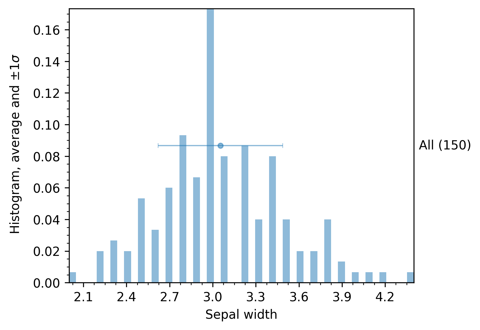
The histogram mode renders a basic plot with information about the distribution, the average, and the standard deviation of the samples, as shown in the next figure. The returned analysis_df dataframe contains the exact values for the mean, standard deviations, etc., for each target column.
The hbar and boxplot modes are most useful when grouping – examples are provided below in the first section about grouping below.
Summary tables
When the get_df method of enb.aanalysis.ScalarNumericAnalyzer is invoked,
it automatically produces summary tables at enb.config.options.analysis_dir.
More specifically,
A CSV file with data statistics for each target column (and each group, if grouping is used):
arithmetic mean
minimum and maximum
standard deviation
median
number of samples
A .tex file with a table containing the mean values of the target columns.
Note that grouping (described in Grouping by a column’s value) is employed in these examples to make it a bit clearer.
Two numeric columns
In this scenario, we want to compare two numeric columns, e.g., sepal_width and petal_width.
To do so, we need to use the enb.aanalysis.TwoNumericAnalyzer class instead of the enb.aanalysis.ScalarNumericAnalyzer
we employed in the previous examples.
These two, and all subclasses of enb.aanalysis.Analyzer share a similar interface rotating around the get_df
method that analyzes and plots
two_numeric_analyzer = enb.aanalysis.TwoNumericAnalyzer()
analysis_df = two_numeric_analyzer.get_df(
    full_df=iris_df, target_columns=[("sepal_width", "petal_length")],
    output_plot_dir=os.path.join(options.plot_dir, "scalar_numeric"),
)
Note
When using enb.aanalysis.TwoNumericAnalyzer, the target_columns parameter must be a list of tuples, each
containing two column names, e.g.: (“columnA”, “columnB”).
Plots
In addition to the analysis_df dataframe with numeric results, this will produce a scatter plot like the following, which also shows +/- 1 horizontal and vertical standard deviations.
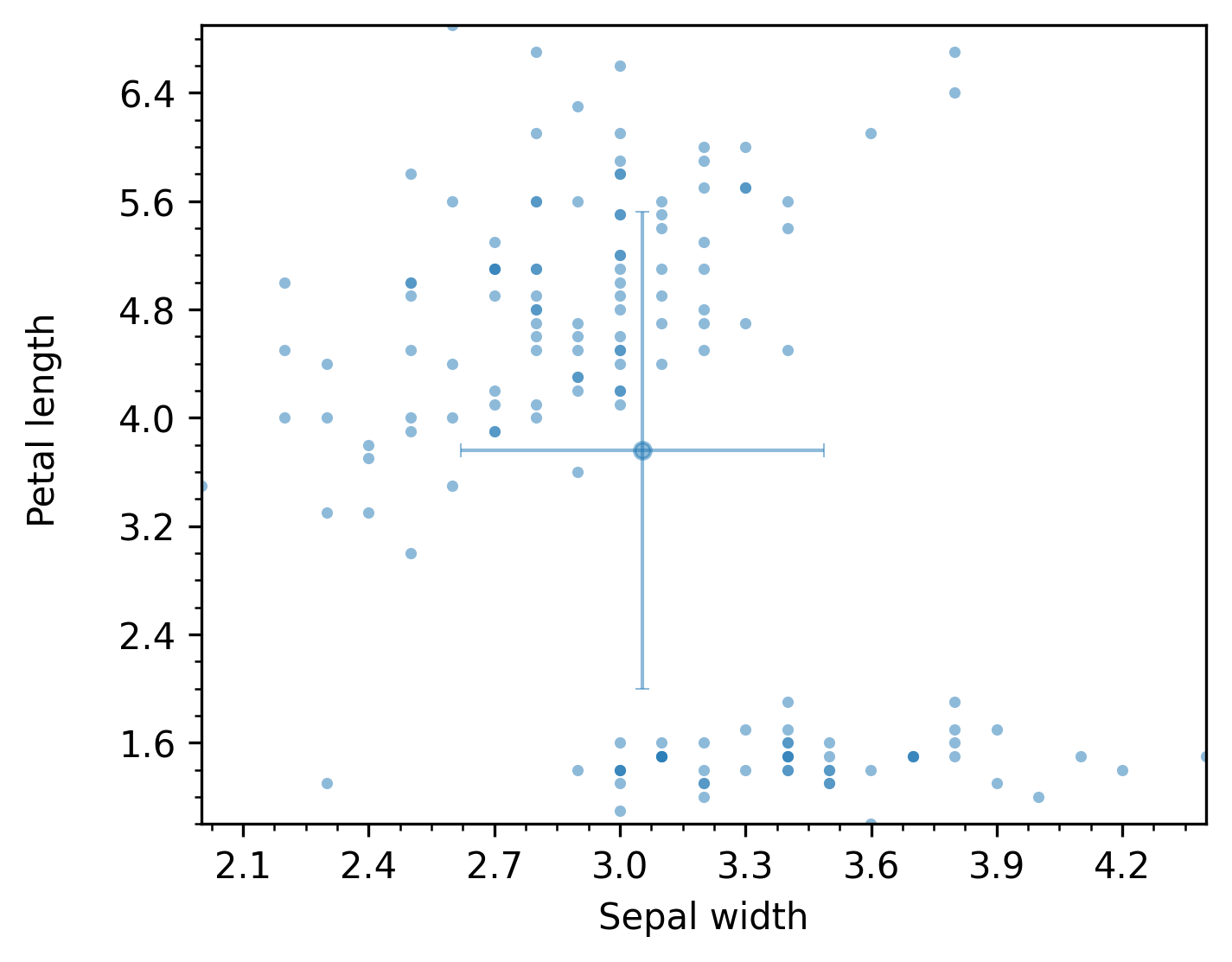
The previous figure shows an example of the scatter plot mode. The following render modes are available for the TwoNumericAnalyzer (they are all rendered by default):
- scatter
- line
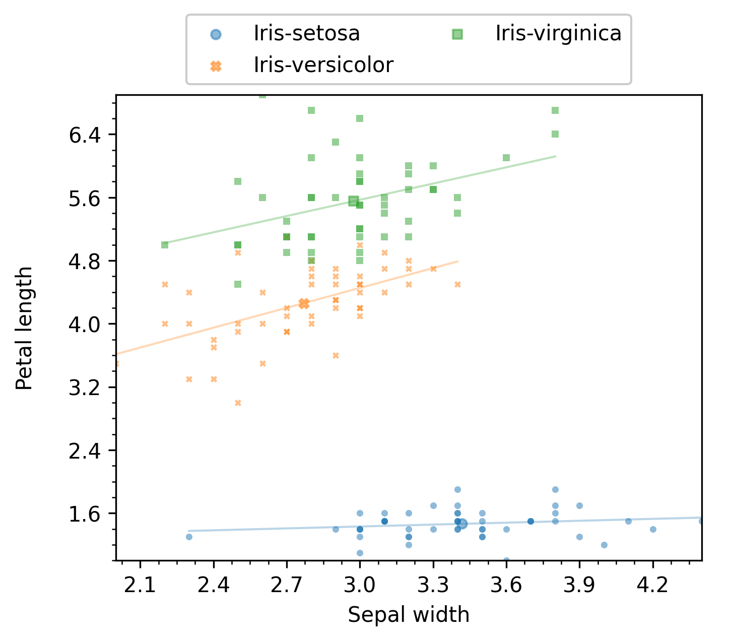
Note that, for the scatter plot mode, it is possible to display linear regression of the data. For instance, the following code
two_numeric_analyzer = enb.aanalysis.TwoNumericAnalyzer()
two_numeric_analyzer.show_x_std = False
two_numeric_analyzer.show_y_std = False
two_numeric_analyzer.show_linear_regression = True
analysis_df = two_numeric_analyzer.get_df(
    full_df=iris_df, target_columns=[("sepal_width", "petal_length")],
    output_plot_dir=os.path.join(options.plot_dir, "styles", style, "two_numeric", "withregression"),
    group_by="class",
    style_list=[style])
will produce a figure like the following:
Additional examples are provided below in Grouping by a column’s value, where some of these modes are most useful.
Summary tables
When the get_df method of enb.aanalysis.TwoNumericAnalyzer is invoked,
it automatically produces summary tables at enb.config.options.analysis_dir.
More specifically,
A CSV file with
All statistics described above in the Summary tables section for each target column.
- For each pair of columns:
Pearson’s correlation coefficient and its p-value
Spearman’s correlation coefficient and its p-value
The linear regression slope and intercept values
A .tex file with a table containing the mean values of the target columns.
Columns with dictionaries
The enb library allows storing dictionaries with scalar entries. For columns with numeric values (integer or float),
the enb.aanalysis.DictNumericAnalyzer class can be used.
In the following example, the dataset contains a column mode_count where keys are the set of possible modes and the values are the number of times each mode has been employed. We can import the dataset with the following lines
import pandas as pd

hevc_df = pd.read_csv("./input_csv/hevc_frame_prediction.csv")
## These two lines are automatically applied
## by get_df of the appropriate experiment - they can be safely ignored
hevc_df["mode_count"] = hevc_df["mode_count"].apply(
    ast.literal_eval)
hevc_df["block_size"] = hevc_df["param_dict"].apply(
    lambda d: f"Block size {ast.literal_eval(d)['block_size']:02d}")
Note
The two last lines transform the string representation of a dict stored in the .csv file into actual python dictionaries.
When using a dataframe returned by get_df of enb, column values contain the actual dictionaries
without needing to apply ast directly.
Warning
If you obtained the dataframe being analyzed outside enb, you need to create a dictionary
with enb.atable.ColumnProperties entries for each dictionary with something like this
column_to_properties = dict(mode_count=enb.atable.ColumnProperties(
    name="mode_count",
    label="Mode index to selection count",
    has_dict_values=True))
If you obtained it from within enb, your enb.atable.ATable or enb.experiment.Experiment instances contain respectively
the column_to_properties and joined_column_to_properties properties that can be used
instead of the previous code. In this case, make sure that the has_dict_values is set to True in
the corresponding column definition.
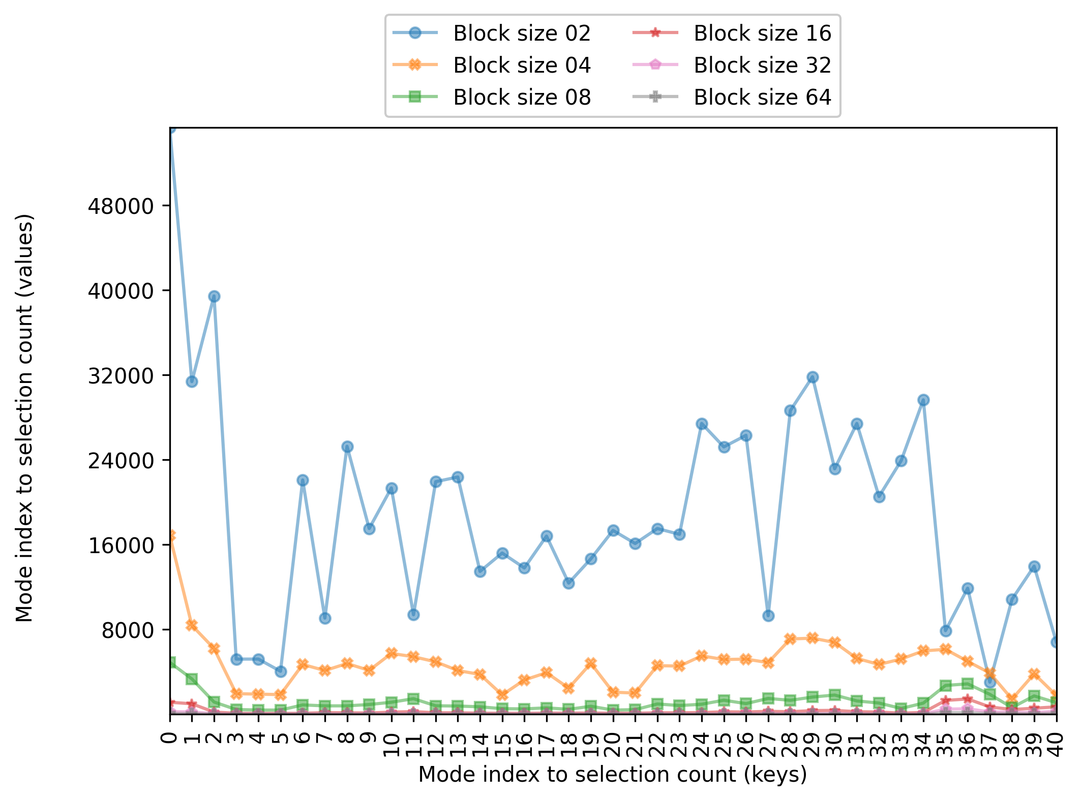
Now, we instantiate enb.aanalysis.DictNumericAnalyzer and run its get_df method. The following code computes the average
count per mode for each of the selected groups (given in the block_size column)
import enb

# Create the analyzer and plot results
numeric_dict_analyzer = enb.aanalysis.DictNumericAnalyzer()
analysis_df = numeric_dict_analyzer.get_df(
    full_df=hevc_df,
    target_columns=["mode_count"],
    group_by="block_size",
    column_to_properties=column_to_properties,
    group_name_order=sorted(hevc_df["block_size"].unique()),

    # Rendering options
    x_tick_label_angle=90,
    fig_width=7.5,
    fig_height=5,
    secondary_alpha=0,
    global_y_label_pos=-0.1)
Note
Some additional rendering options are included here to improve presentation. Rendering options are discussed in a later section.
Plotting
The resulting figure is shown below
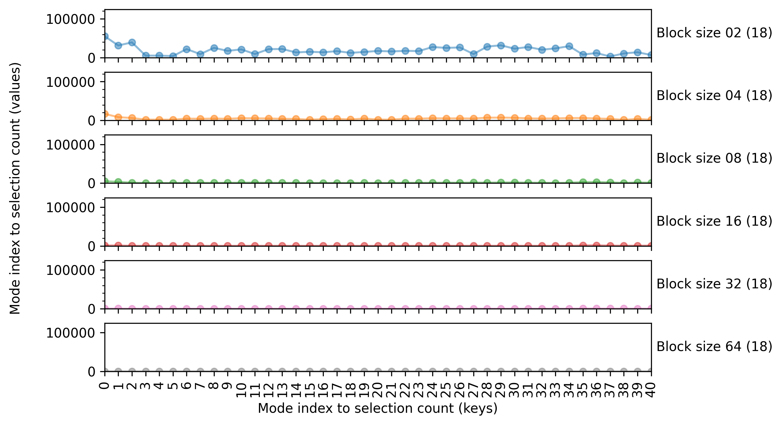
Summary tables
The enb.aanalysis.DictNumericAnalyzer class produces CSV files with several statistics
(mean, min, max, median, standard deviation) for each key of each target column.
Analysis of numeric data in an x-y (2D) space
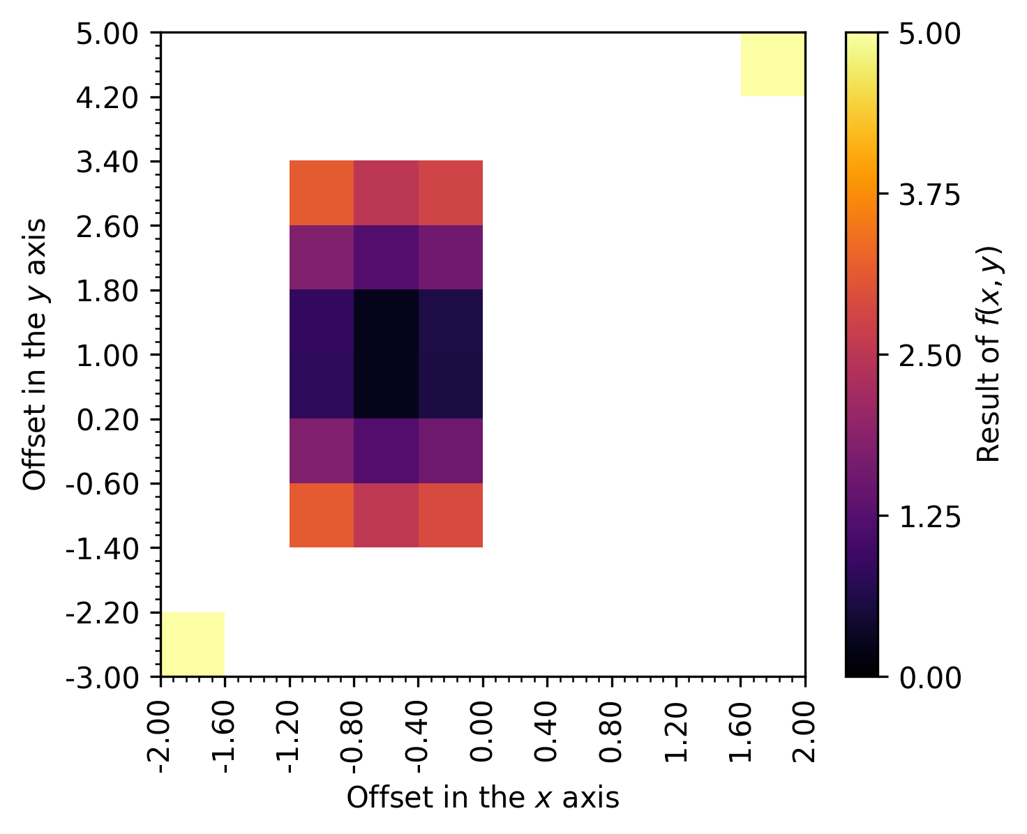
The enb.aanalysis.ScalarNumeric2DAnalyzer class allows to plot data arranged arbitrarily in the x-y plane.
It is useful to create heatmap figures.
Note
The enb.aanalysis.ScalarNumeric2DAnalyzer class cannot handle categorical (e.g., string) x or y columns.
In that scenario, you can consider the enb.aanalysis.ScalarNumericJointAnalyzer class in Joint numeric analysis (double categorical grouping).
- You will need:
a column with scalar numerical data (integers or float entries), e.g., column_data
two more columns with scalar numerical data specifying the x and y coordinates of each datapoint, e.g., column_x and column_y.
You can then invoke the get_df method like any other enb.aanalysis.Analyzer subclass, with the target_columns argument
being a list of 3-element tuples.
In the following example of the ‘colormap’ render mode, the value column contains the data of interest, while x and y contain the spatial information.
import os
import pandas as pd
import enb

# Read data from CSV - could be obtained from an ATable instance
df_2d = pd.read_csv(os.path.join("input_csv", "2d_data_example.csv"))

# Perform analysis
sn2da = enb.aanalysis.ScalarNumeric2DAnalyzer()
sn2da.bin_count = 10
sn2da.get_df(full_df=df_2d,
             target_columns=[("x", "y", "value")],
             column_to_properties={
                            "value": enb.atable.ColumnProperties("value", label="Result of $f(x,y)$"),
                            "x": enb.atable.ColumnProperties("x", label="Offset in the $x$ axis"),
                            "y": enb.atable.ColumnProperties("y", label="Offset in the $y$ axis")})
Plots
The resulting figure is shown next:
Note
You can configure the employed colormap by modifying your enb.aanalysis.ScalarNumeric2DAnalyzer instance attributes,
e.g., you can set color_map to any color map name accepted by matplotlib, e.g.,
sn2da = enb.aanalysis.ScalarNumeric2DAnalyzer()
sn2da.color_map = "Oranges"
See https://matplotlib.org/stable/gallery/color/colormap_reference.html for more information about available colormaps.
Summary tables
The enb.aanalysis.ScalarNumeric2DAnalyzer class produces:
CSV files with the same statistics as those of
enb.aanalysis.ScalarNumericAnalyzer(see Summary tables: min, max, mean, median, standard deviation) for each selected x, y and value column..tex files with the average of each selected x, y and value column.
Joint numeric analysis (double categorical grouping)
With enb.aanalysis.ScalarNumericJointAnalyzer, it is possible to analyze scalar numeric data
jointly splitting it by two different groupings. This results in a table where the
columns correspond to one of the categories/groupings (e.g., corpus name)
and the rows to the other category/grouping (e.g., task label).
Cells correspond to the averages for the data column.
- You will need:
A column with scalar numerical data (integers or float entries), e.g., column_data
Two more columns with categorical (e.g., string) data specifying the grouping along the x axis and the y axis, e.g., column_x and column_y.
Note
The enb.aanalysis.ScalarNumericJointAnalyzer supports any type for the x and y columns as long
as str can be applied to them. If you want to use numeric data for both x and y,
where (x,y) conveys some spatial location notion, consider enb.aanalysis.ScalarNumeric2DAnalyzer
in Analysis of numeric data in an x-y (2D) space.
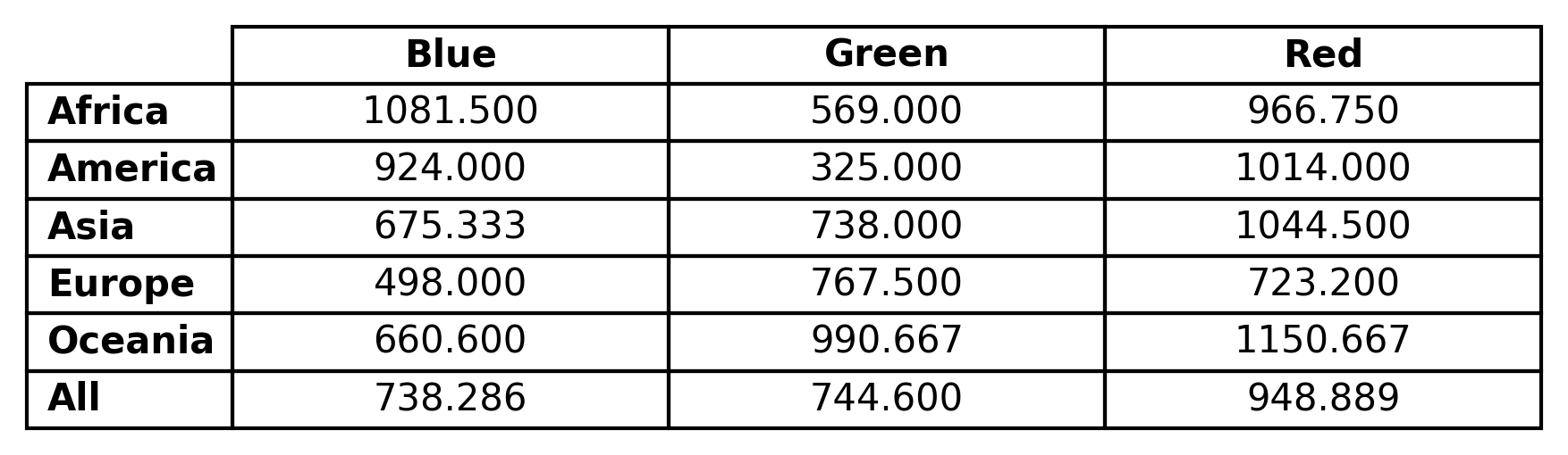
In the following example of the ‘table’ render mode, the Price column contains the data of interest, while Color and Origin contain the categorical data for joint analysis.
import os
import pandas as pd
import enb

df_joint = pd.read_csv(os.path.join("input_csv", "continent_data_example.csv"))

snja = enb.aanalysis.ScalarNumericJointAnalyzer()
snja.get_df(full_df=df_joint,
            target_columns=[("Color", "Origin", "Price")])
Plots
The resulting plot, corresponding to the average value of the data column, is shown in the following figure:
Note
You can pass fig_height, fig_width or both to the get_df method of enb.aanalysis.ScalarNumericJointAnalyzer
to control the size of the displayed table.
Summary tables
The enb.aanalysis.ScalarNumericJointAnalyzer produces custom
CSV
and
CSV file
files corresponding to the above table.
These files contain tables for several statistics: average, min, max, standard deviation, median and count. All these correspond to the finite data found for each x-category and y-category combination.
An example of LaTeX output is shown below
% Column selection: 'Color' 'Origin' 'Price'
% Statistic: avg
\begin{tabular}{lccc}
\toprule
                 & \textbf{Blue} & \textbf{Green} & \textbf{Red} \\
\toprule
\textbf{Africa}  & 1081.500 & 569.000  & 966.750  \\
\textbf{America} & 924.000  & 325.000  & 1014.000 \\
\textbf{Asia}    & 675.333  & 738.000  & 1044.500 \\
\textbf{Europe}  & 498.000  & 767.500  & 723.200  \\
\textbf{Oceania} & 660.600  & 990.667  & 1150.667 \\
\midrule
\textbf{All}     & 738.286  & 744.600  & 948.889  \\
\bottomrule
\end{tabular}
The corresponding CSV file is as follows:
# Column selection: 'Color' 'Origin' 'Price'
## Statistic: avg
### Group: 'All'
,Blue,Green,Red
Africa,1081.500,569.000,966.750
America,924.000,325.000,1014.000
Asia,675.333,738.000,1044.500
Europe,498.000,767.500,723.200
Oceania,660.600,990.667,1150.667
All,738.286,744.600,948.889
Output configuration
You can select the order of column headers and/or row headers by passing x_header_list, y_header_list, or both to
enb.aanalysis.ScalarNumericJointAnalyzer.get_df(). When one is present, it must be a non-empty list containing strings that match exactly one or more of the existing row or column headers (e.g., one or more of [“Blue”, “Green”, “Red”] when specifying x_header_list in the previous example.You can also enable/disable the global “All” row by adding show_global_row=True/show_global_row=False to the get_df call of your
enb.aanalysis.ScalarNumericJointAnalyzerinstance. The “All” row contains the average of all samples in all other rows. Similarly, the “All” column contains the average of all samples in all other columns. Note that, if different rows/columns are computed using different numbers of elements, the “All” column/row will not necesssarily be identical to the average of row/column averages. Also note that, if x_header_list and/or y_header_list is employed, the “All” row/column is computed using only the samples of those selected rows/columns.You can pass the highlight_best_row and/or the highlight_best_column arguments to get_df. If you do, their value should be “high”, “low” to highlight the highest and lowest value in each row and/or column, respectively.
As explained later in Making baseline comparisons, you can select a column or a row as reference, by passing the reference_group parameter to
enb.aanalysis.ScalarNumericJointAnalyzer.get_df(). You can control whether the reference group is shown or not by modifying the show_reference_group of yourenb.aanalysis.ScalarNumericJointAnalyzerinstance.
The following example uses all these features (except for reference_group), which can be independently selected:
import os
import pandas as pd
import enb

df_joint = pd.read_csv(os.path.join("input_csv", "continent_data_example.csv"))

snja = enb.aanalysis.ScalarNumericJointAnalyzer()
snja.get_df(full_df=df_joint,
            target_columns=[("Color", "Origin", "Price")],
            # Show only these x/y categories, in this order
            x_header_list=["Green", "Blue"],
            y_header_list=["Europe", "America", "Africa"],
            # Hide the "All" row
            show_global_row=False,
            # Show the "All" column
            show_global_column=True,
            # Highlight the lowest element in each row
            highlight_best_row="low")
and produces the following result,
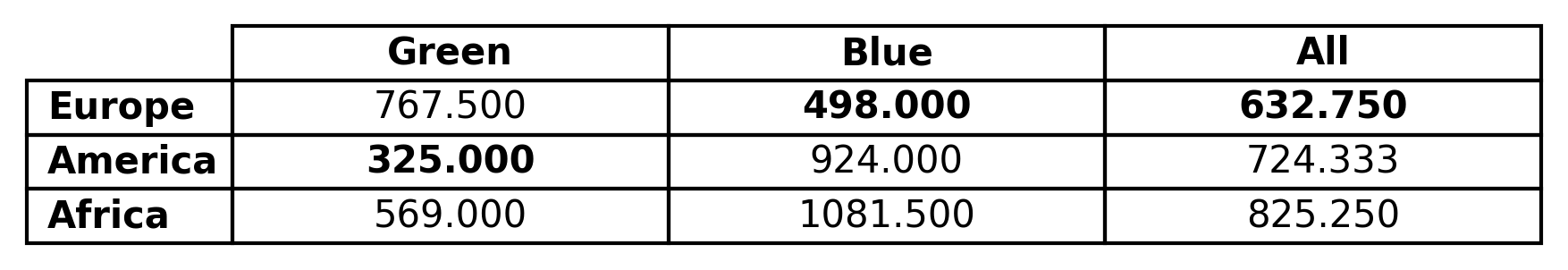
and corresponding Latex code:
% Statistic: avg
\begin{tabular}{lcc}
\toprule
                 & \textbf{Green}    & \textbf{Blue}     & \textbf{All}      \\
\toprule
\textbf{Europe}  & 767.500           & \textbf{498.000}  & \textbf{632.750}  \\
\textbf{America} & \textbf{325.000}  & 924.000           & 724.333           \\
\textbf{Africa}  & 569.000           & 1081.500          & 825.250           \\
\bottomrule
\end{tabular}
Grouping by a column’s value
Grouping with ScalarNumericAnalysis
Often, we want to group the dataframe’s rows based on the value of a given column, and then analyze others.
We achieve this by passing that the grouping column’s name as the group_by keyword when calling ScalarNumericAnalyzer’s get_df method.
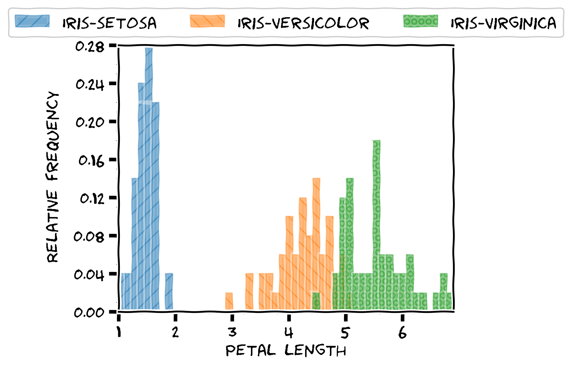
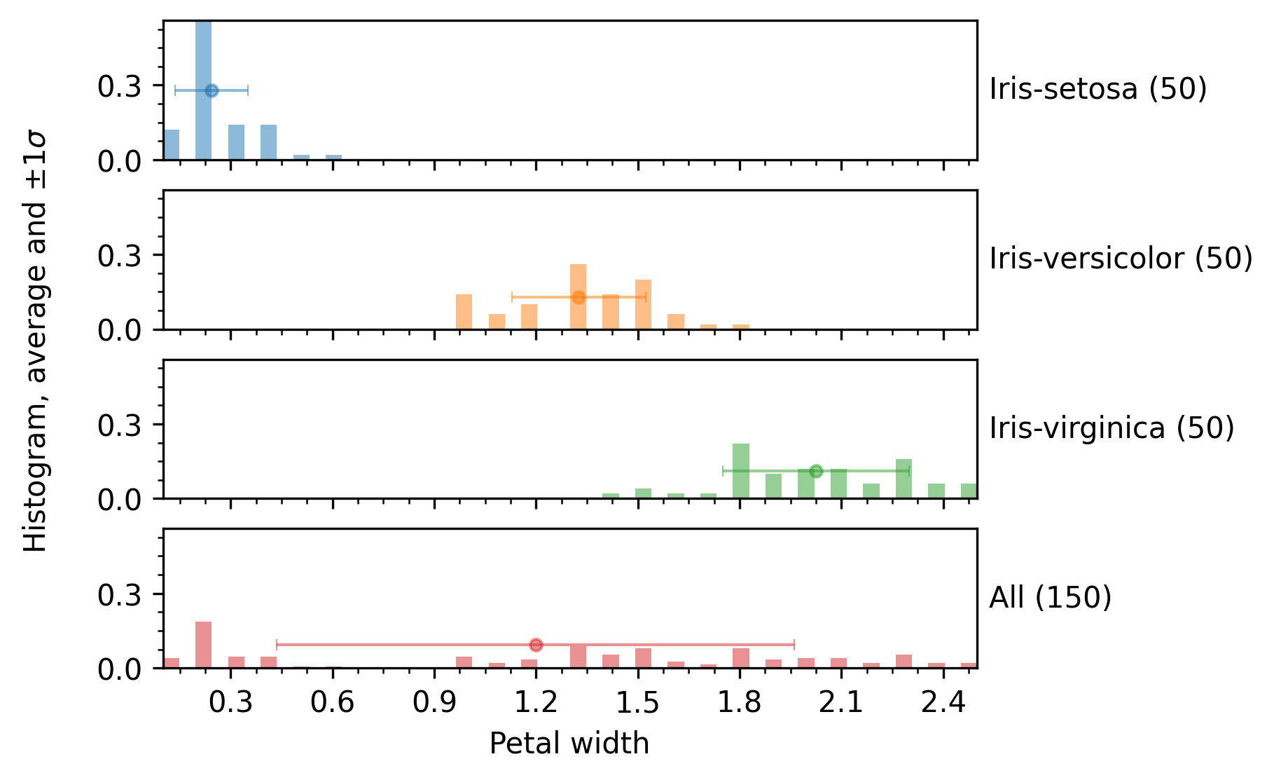
Continuing with the Iris experiment above, we can show results grouped by class (present in the original .csv) as follows:
analyzer = enb.aanalysis.ScalarNumericAnalyzer()
analysis_df = analyzer.get_df(
    full_df=iris_df,
    target_columns=["sepal_length", "sepal_width",
                     "petal_length", "petal_width"],
    group_by="class")
By default, all of the following render modes are used with enb.aanalysis.ScalarNumericAnalyzer:
- histogram
- hbar
- boxplot
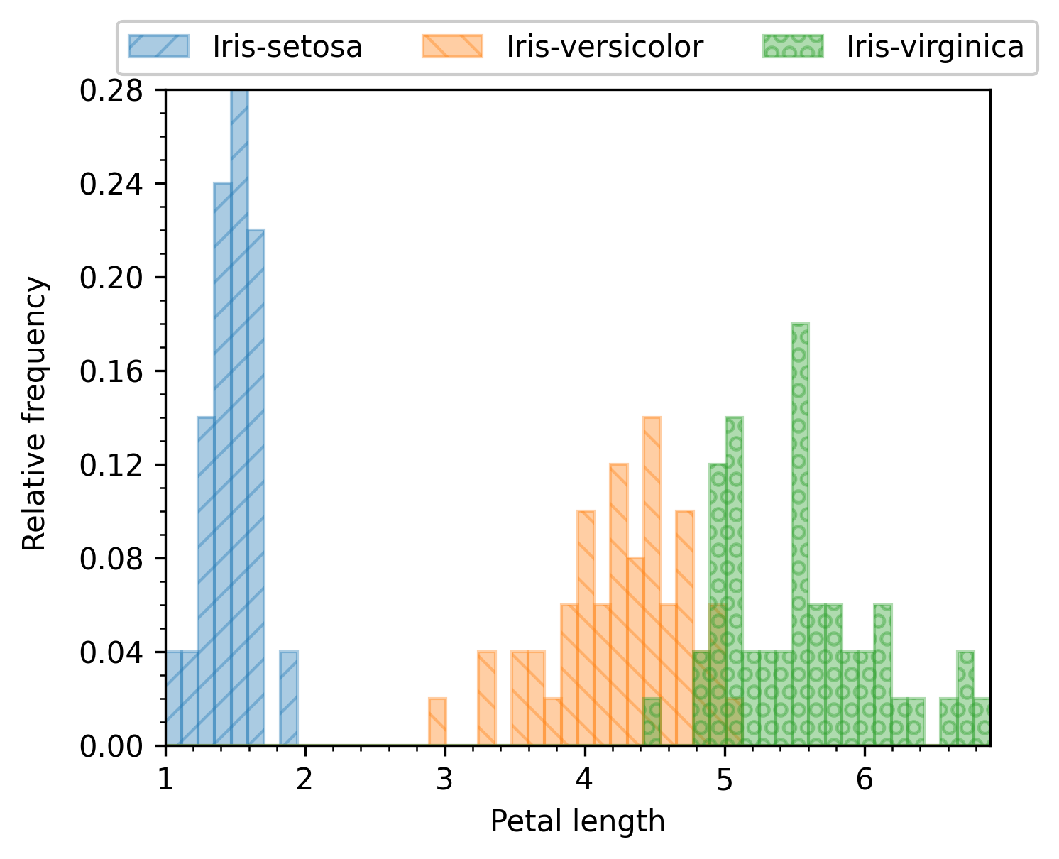
The histogram render mode produces plots like the following:
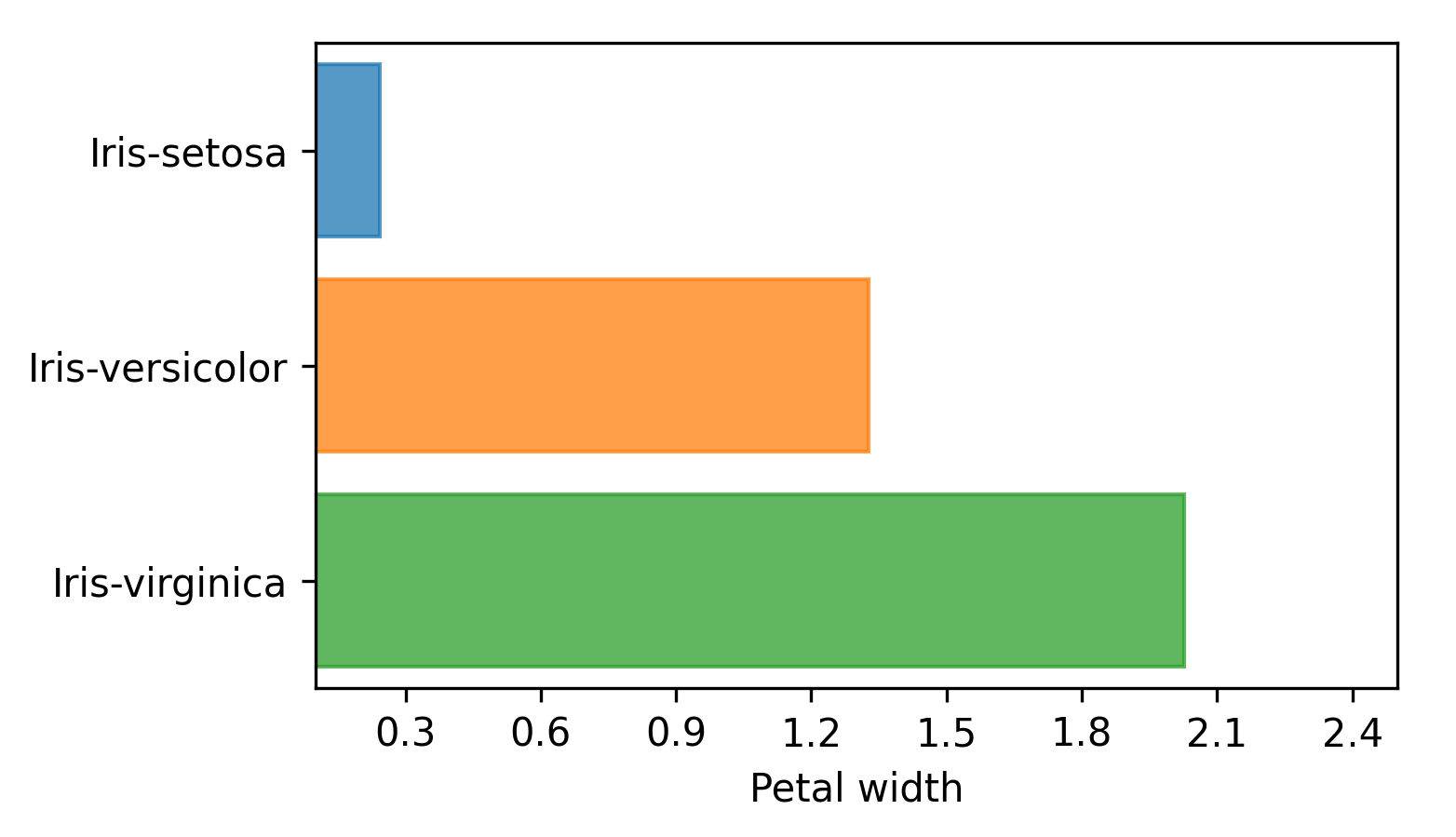
The hbar render mode produces horizontal bar plots with length equal to the average, as shown in the following image:
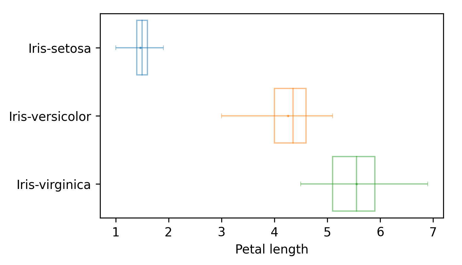
The boxplot render mode produces standard box plots where lines span the entire input data range, the vertical lines in the box plot indicates quartiles Q1, Q2 and Q3, and the mean value is also displayed, as shown next:
Grouping with other Analyzer subclasses
Grouping is not restricted to enb.aanalysis.ScalarNumericAnalyzer. It can be used with other enb.aanalysis.Analyzer classes such as
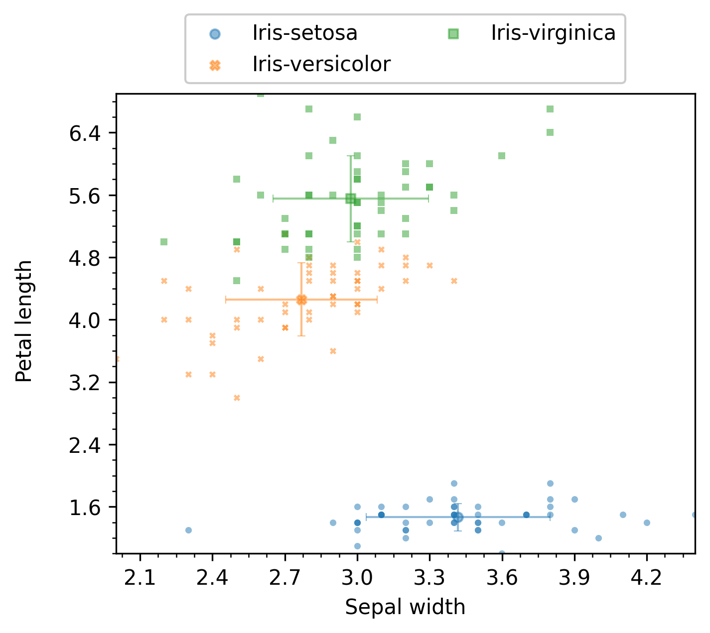
enb.aanalysis.TwoNumericAnalyzer, as in the following code:
two_numeric_analyzer = enb.aanalysis.TwoNumericAnalyzer()
analysis_df = two_numeric_analyzer.get_df(
    full_df=iris_df, target_columns=[("sepal_width", "petal_length")],
    group_by="class",
)
By default, all of the following render modes are used with enb.aanalysis.TwoNumericAnalyzer:
- scatter
- line
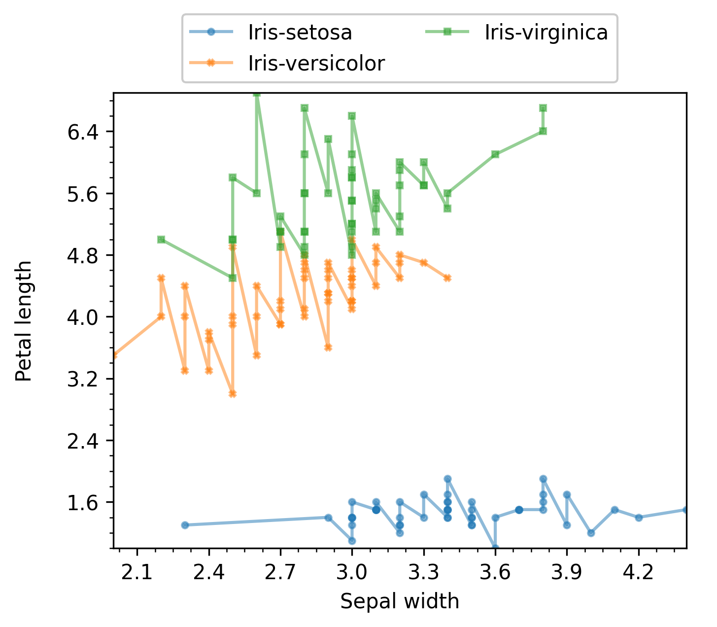
The resulting plot for the scatter mode is shown next:
The resulting plot for the line mode is shown next:
Grouping by task families
When enb.experiment.Experiment is used to obtain dataframes of results, it is typical to have families
of tasks that were applied separately but are related. This can be used by defining a list
of class:enb.experiment.TaskFamily instances and passing that argument to the group_by parameter of get_df.
For instance, for an input we might want to run algorithms A and B. Algorithm A is to be run with two parameter configurations: A1 and A2, while algorithm B is to be run with configurations B1, B2, B3 and B4. In this case, two families would be created, e.g., with labels “Algorithm A” and “Algorithm B”, with 2 and 4 tasks in them.
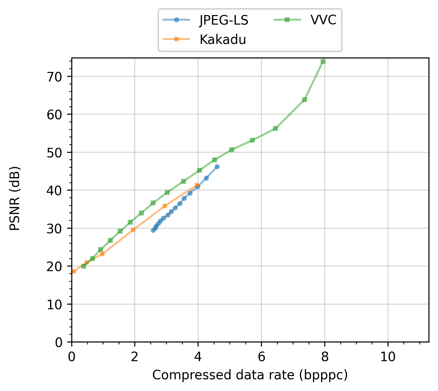
In the following figure, several algorithms are compared varying the configurations that affect their “Compressed data rate”. Please see the Image compression and manipulation page for a full experiment that uses task families and produces plots like the one in the figure.
Combining groups
The combine_groups argument can be passed to get_df or set in the enb.aanalysis.ScalarNumericAnalyzer instance.
If selected, all groups are shown in the same subplot. In this case, the average and standard deviation
values are automatically removed for clarity. An example of this output can be found next:
enb.aanalysis.ScalarNumericAnalyzer().get_df(
    full_df=iris_df,
    target_columns=["sepal_length", "sepal_width",
                    "petal_length", "petal_width"],
    group_by="class",
    output_plot_dir=os.path.join(
        options.plot_dir, "scalar_combined_groups"),
    legend_column_count=3,
    combine_groups=True,
)
Groups are automatically combined for enb.aanalysis.TwoNumericAnalyzer, but are optional for enb.aanalysis.DictNumericAnalyzer.
An example is provided next:
Making baseline comparisons
When grouping is used, it is possible to select one of the groups as baseline and then perform analysis and plotting on the differences against that baseline.
For the enb.aanalysis.Analyzer subclasses and render modes that support it, it suffices to pass
reference_group=”group name” when calling get_df. Here, “group name” is one
of the group labels derived from the group_by selection.
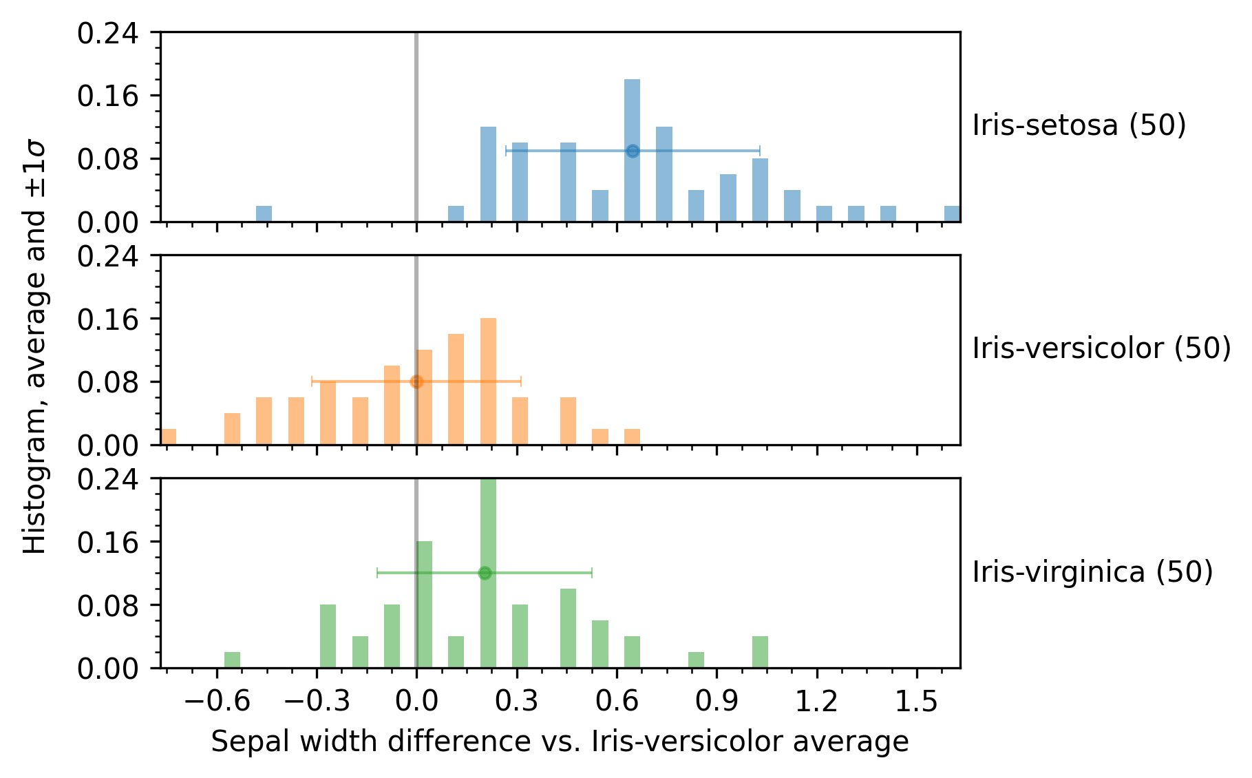
Example with enb.aanalysis.ScalarNumericAnalyzer
The following snippet shows how to use the enb.aanalysis.ScalarNumericAnalyzer to show differences against a group.
iris_df = pd.read_csv("./input_csv/iris_dataset.csv")
scalar_analyzer = enb.aanalysis.ScalarNumericAnalyzer()
analysis_df = scalar_analyzer.get_df(
    full_df=iris_df, target_columns=["sepal_length", "sepal_width", "petal_length", "petal_width"],
    group_by="class",
    reference_group="Iris-versicolor",
    output_plot_dir=os.path.join(options.plot_dir, "scalar_numeric_reference"))
The resulting plot is shown in the next figure.
You can choose whether the group used as baseline is employed or not, by setting your analyzer instance’s show_reference_group attribute, i.e.,
scalar_analyzer.show_reference_group = False
before calling get_df.
Note that you can combine reference_group and combine_groups if you want. An example where both options are used is shown next:
scalar_analyzer.show_reference_group = False
scalar_analyzer.get_df(
    full_df=iris_df,
    target_columns=["sepal_length", "sepal_width", "petal_length", "petal_width"],
    group_by="class",
    output_plot_dir=os.path.join(options.plot_dir, "scalar_combined_reference"),
    combine_groups=True,
    legend_column_count=3,
    reference_group="Iris-versicolor",
)
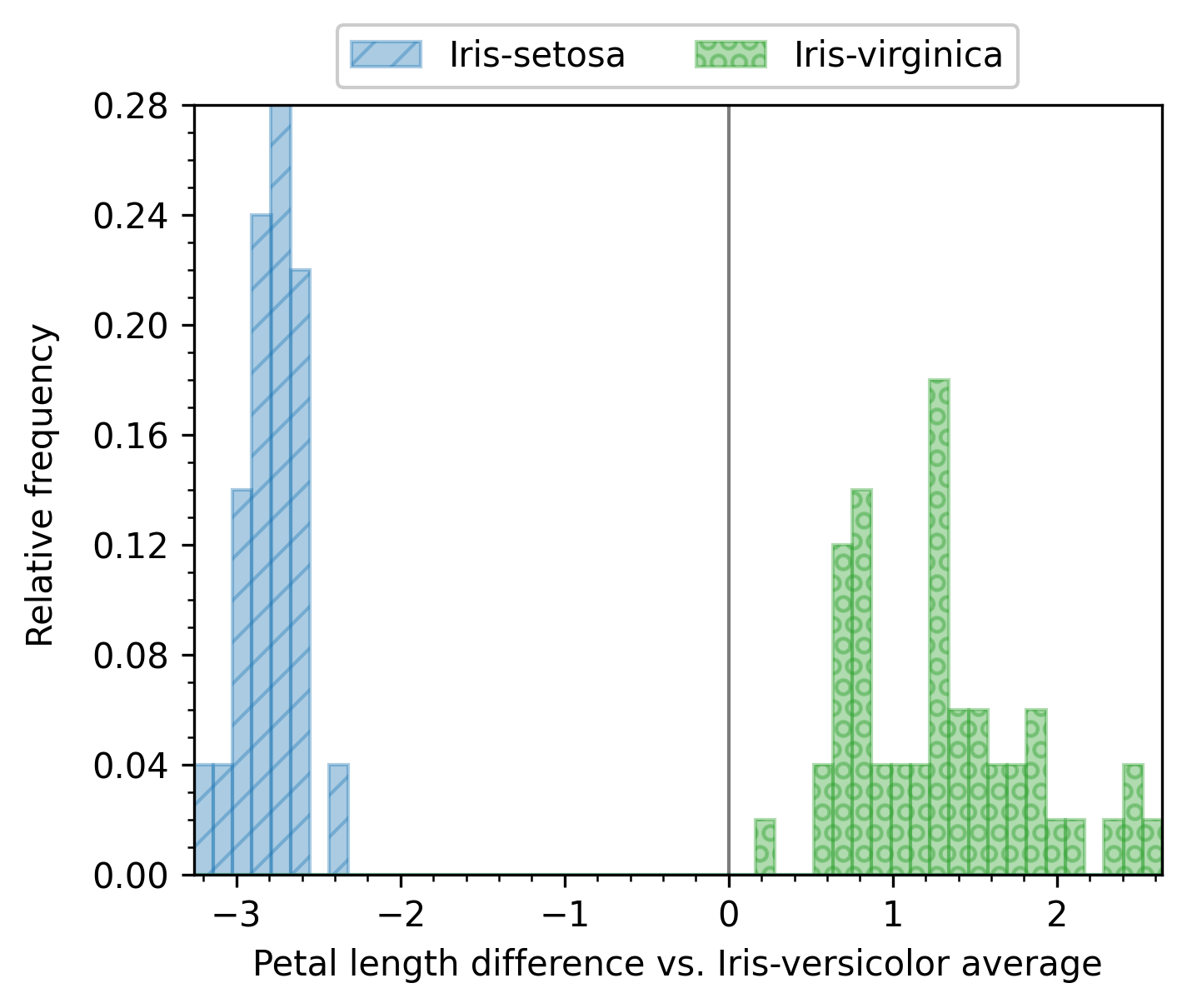
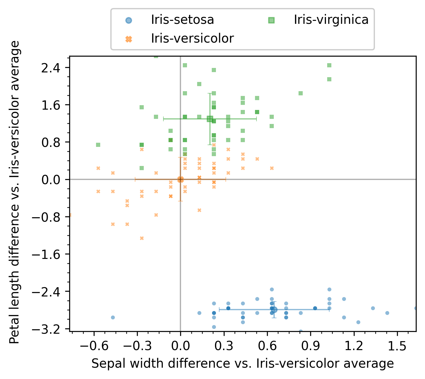
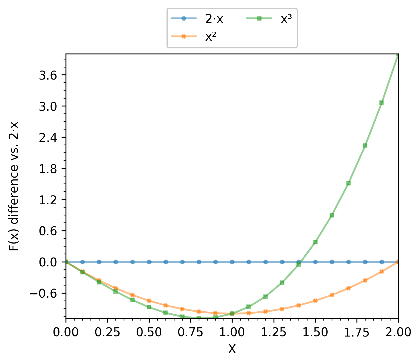
Example with enb.aanalysis.TwoNumericAnalyzer
The enb.aanalysis.TwoNumericAnalyzer class has a sintax similar to enb.aanalysis.ScalarNumericAnalyzer.
Both the line and scatter render modes are available, but only one can be used per call to get_df.
two_numeric_analyzer = enb.aanalysis.TwoNumericAnalyzer()
# scatter baseline reference
analysis_df = two_numeric_analyzer.get_df(
    full_df=iris_df, target_columns=[("sepal_width", "petal_length")],
    output_plot_dir=os.path.join(options.plot_dir, "two_numeric_reference"),
    group_by="class", reference_group="Iris-versicolor",
    selected_render_modes=["scatter"]
)
# line baseline reference
function_df = pd.read_csv("./input_csv/function.csv")
analysis_df = two_numeric_analyzer.get_df(
    full_df=function_df, target_columns=[("sepal_width", "petal_length")],
    output_plot_dir=os.path.join(options.plot_dir, "two_numeric_reference"),
    group_by="class", reference_group="Iris-versicolor",
    selected_render_modes=["scatter"]
)
When scatter is selected, the average value for the reference group is calculated for each x and y column. Then that value is subtracted from all samples. The point cloud of the reference group is then centered at (0,0) and all other groups are compared both in the x and y column to the reference.
When line is selected, groups are expected to be x-aligned. That is, they share the same values of the x column. The average value of the y column for each x value is subtracted from all samples at that x value. For instance, if the x column contains values of a variable x, and the y column contains f(x), g(x), h(x), then one can use f as the reference group, which results in plotting f(x)-f(x), g(x)-f(x) and h(x)-f(x).
Customizing plot appearance
If the default plot appearance does not suit you (axis limits, font size, color scheme, logarithmic scale, etc.), enb offers several ways of customizing them, described in the following subsections.
Choosing a plot type
You can change the type of plot by selecting one of the available enb.aanalysis.Analyzer classes.
See above for examples on all available classes.
Some analyzers provide several render modes. You can select one or more of them by
passing the selected_render_modes argument to your get_df calls.
By default, all render modes in an enb.aanalysis.Analyzer are used.
Modifying your Analyzers
The enb.aanalysis.Analyzer classes themselves have several attributes that affect the way they
produce plots. Some examples common to all enb.aanalysis.Analyzer instances are as follows.
# List of allowed rendering modes for the analyzer
valid_render_modes = set()
# Selected render modes (by default, all of them)
selected_render_modes = %(valid_render_modes)s
# If more than one group is present, they are shown in the same subplot
# instead of in different rows
combine_groups = False

# If not None, it must be a list of matplotlibrc styles (names or file paths)
style_list = None
# Default figure width
fig_width = 5.0
# Default figure height
fig_height = 4.0
# Relative horizontal margin added to plottable data in figures, e.g. 0.1 for a 10% margin
horizontal_margin = 0
# Relative vertical margin added to plottable data in figures, e.g. 0.1 for a 10% margin
vertical_margin = 0
# Margin between group rows (None to use matplotlib's default)
group_row_margin = None

# Show grid lines at the major ticks?
show_grid = False
# Show grid lines at the minor ticks?
show_subgrid = False
# If applicable, show a horizontal +/- 1 standard deviation bar centered on the average
show_x_std = False
# If applicable, show a vertical +/- 1 standard deviation bar centered on the average
show_y_std = False
# If True, display group legends when applicable
show_legend = True
# Default number of columns inside the legend
legend_column_count = 2
# Legend position (if configured to be shown). It can be "title" to show it above the plot,
# or any matplotlib-recognized argument for the loc parameter of legend()
legend_position = "title"
# If more than one group is displayed, when applicable, adjust plots to use the same scale in every subplot?
common_group_scale = True

# Main title to be displayed
plot_title = None
# Show the number of elements in each group?
show_count = True
# Show a group containing all elements?
show_global = False
# If a reference group is used as baseline, should it be shown in the analysis itself?
show_reference_group = True

# Main marker size
main_marker_size = 4
# Secondary (e.g., individual data) marker size
secondary_marker_size = 2
# Thickness of secondary plot lines
secondary_line_width = 1
# Main plot element alpha
main_alpha = 0.5
# Thickness of the main plot lines
main_line_width = 2
# Secondary plot element alpha (often overlaps with data using main_alpha)
secondary_alpha = 0.3
# If a semilog y axis is used, y_min will be at least this large to avoid math domain errors
semilog_y_min_bound = 1e-5

# Number of decimals used when showing decimal values in latex
latex_decimal_count = 3
Default values for these attributes can be set by placing a file with .ini extension in your project root (where your scripts are placed). This file should contain a subset of the attributes defined in the full enb.ini configuration file.
Note
Attributes must be stored in sections with name given by the enb.aanalysis.Analyzer class, e.g.,
‘[enb.aanalysis.Analyzer]’ or ‘[enb.aanalysis.ScalarNumericAnalyzer]’.
You can install a copy of the full configuration file and then modify it as needed with:
enb plugin install enb.ini ./your_project_folder/
Once an enb.aanalysis.Analyzer has been instantiated, its attributes can be modified like any other object.
Attribute values are independently read for each call to get_df.
Setting column plotting hints
All columns defined in enb.atable.ATable subclasses (including enb.experiment.Experiment subclasses)
have a corresponding enb.atable.ColumnProperties instance.
These instances contain rendering hints when plotting that column such as:
axis labels (e.g., label=’Average duration (s)’)
plot limits (e.g., plot_min=0, plot_max=60, which can also be set to None for automatic limits)
axis type (e.g., semilog_x=True)
As detailed in Basic workflow: enb.atable.ATable, these hints can be set when defining custom columns, e.g.,
class MyTable(enb.atable.ATable):
    @enb.atable.column_function(enb.atable.ColumnProperties(
        name="average_duration_seconds",
        label="Average duration (s)",
        plot_min=0,
        plot_max=60))
    def set_average_duration_seconds(self, file_path, row):
        row[_column_name] = # ... your code here
One can then pass the column_to_properties argument to an Analyzer’s get_df method, e.g.,
mt = MyTable()
df = # ... e.g., mt.get_df(), see examples above
enb.aanalysis.ScalarNumericAnalyzer().get_df(
    full_df=df,
    column_to_properties=mt.column_to_properties)
See enb.atable.ColumnProperties.__init__() for full details on all available attributes.
Note
You can modify
enb.atable.ColumnPropertiesinstances after they have been associated to a column, e.g.,mt.column_properties["average_duration_seconds"].plot_max = 30
You can create your own dictionary indexed by column name, containing
enb.atable.ColumnPropertiesinstances, and then pass it to get_df, e.g.,:enb.aanalysis.ScalarNumericAnalyzer().get_df( full_df=df, column_to_properties=dict(average_duration_seconds=enb.atable.ColumnProperties( plot_min=0, plot_max=30, label=r"$\Gamma$ routine execution time (seconds)")))
enb.experiment.Experimentsubclasses also offer the joined_column_to_properties property, whichcontains the columns defined in that experiment, and in the
enb.atable.ATablesubclass employed for the dataset (see Experiments = data + tasks for more information about experiments), e.g.:
# Initialize and run experiment
exp = MyExperimentClass()
df = exp.get_df()

# Analyze results
scalar_columns = ["column_A", "column_B"]
scalar_analyzer = enb.aanalysis.ScalarNumericAnalyzer()
scalar_analyzer.get_df(
    full_df=df,  target_columns=scalar_columns,
    group_by="task_label",  selected_render_modes={"histogram"},

    # Experiments offer the `joined_column_to_properties` property
    column_to_properties=exp.joined_column_to_properties,
)
Setting **render_kwargs when calling Analyzer.get_df
The get_df method of all enb.aanalysis.Analyzer subclasses accept a **render_kwargs parameter.
Note
Values passed in this parameter overwrite those defined in column_properties.
You can add one or more key=value arguments to the get_df call, as shown in the following example.
numeric_dict_analyzer = enb.aanalysis.DictNumericAnalyzer()
hevc_df = pd.read_csv("./input_csv/hevc_frame_prediction.csv")
numeric_dict_analyzer.secondary_alpha = 0
analysis_df = numeric_dict_analyzer.get_df(
    full_df=hevc_df,
    target_columns=["mode_count"],
    group_by="block_size",
    column_to_properties=column_to_properties,
    group_name_order=sorted(hevc_df["block_size"].unique()),

    # Rendering options
    x_tick_label_angle=90,
    fig_width=7.5,
    fig_height=5,
    global_y_label_pos=-0.01)
Here, the labels of the x ticks are rotated 90 degrees, the figure dimensions are changed, and the global y axis label is moved to account for very long y-axis labels.
Please refer to enb.plotdata.render_plds_by_group() for a list of all available parameters.
Note that the pds_by_group_name parameter and others are automatically set by your choice of enb.aanalysis.Analyzer subclass.
Using styles
The enb library employs matplotlib for plotting. Matplotlib’s styling features are available in two ways:
You can set the style_list attribute of your
enb.aanalysis.Analyzersubclass (default value or instance attribute).You can pass the style_list argument to the call to get_df of your
enb.aanalysis.Analyzersubclass.
For instance, to set Matlplotlib’s dark style, the following code can be used:
## Option 1: modify analyzer instance
scalar_analyzer = enb.aanalysis.ScalarNumericAnalyzer()
scalar_analyzer.style_list = ["dark_background"]
analysis_df = scalar_analyzer.get_df(
    full_df=iris_df, target_columns=["sepal_length", "sepal_width", "petal_length", "petal_width"],
    output_plot_dir=os.path.join(options.plot_dir, "scalar_numeric_dark", "instance"),
    group_by="class")

## Option 2: use get_df's **kwargs
scalar_analyzer = enb.aanalysis.ScalarNumericAnalyzer()
analysis_df = scalar_analyzer.get_df(
    full_df=iris_df, target_columns=["sepal_length", "sepal_width", "petal_length", "petal_width"],
    output_plot_dir=os.path.join(options.plot_dir, "scalar_numeric_dark", "kwargs"),
    group_by="class",
    style_list=["dark_background"])
Each element in style_list must be one of the following:
One of Matplotlib’s style names (e.g., “dark_background”, “bmh”, etc) configured in your machine. You can check out the `gallery of matplotlib’s default styles.
One of enb’s predefined style names.
Note
You can get a list of all available style names from the CLI with
enb show styles
or within python with
enb.plotdata.get_available_styles()
An example output is as follows:
        - 'Solarize_Light2'
        - 'bmh'
        - 'classic'
        - 'dark_background'
        - 'default'
        - 'fast'
        - 'fivethirtyeight'
        - 'ggplot'
        - 'grayscale'
        - 'petroff10'
        - 'seaborn-v0_8'
        - 'seaborn-v0_8-bright'
        - 'seaborn-v0_8-colorblind'
        - 'seaborn-v0_8-dark'
        - 'seaborn-v0_8-dark-palette'
        - 'seaborn-v0_8-darkgrid'
        - 'seaborn-v0_8-deep'
        - 'seaborn-v0_8-muted'
        - 'seaborn-v0_8-notebook'
        - 'seaborn-v0_8-paper'
        - 'seaborn-v0_8-pastel'
        - 'seaborn-v0_8-poster'
        - 'seaborn-v0_8-talk'
        - 'seaborn-v0_8-ticks'
        - 'seaborn-v0_8-white'
        - 'seaborn-v0_8-whitegrid'
        - 'single_column'
        - 'slides'
        - 'tableau-colorblind10'
        - 'two_columns'
        - 'xkcd'
The path of a matplotlib rc style.
See matplotlib’s rc file documentation for more information on how to create and modify this type of files.
You can install an editable copy of Matplotlib’s default rc file with:
enb plugin install matplotlibrc .
Note
You can select any number of styles for your plots. When a list of styles is used for a plot, its elements are processed from left to right. Therefore, you can compose themes just like one would in Matplotlib https://matplotlib.org/stable/tutorials/introductory/customizing.html#composing-styles.
Warning
Not all styles are necessarily intended for professional usage (-: